Business Card Layout
Here's a business card layout with grid structure:
 |
| DISNEY BUSINESS CARDS |
 |
| BUSINESS CARD DESIGN |
Find 2 magazine layouts that adhere to a grid. Take a photo/ scan them. Indicate on each one where the grid is. Use a marker pen if necessary. Make sure you take a photo before you cover it with pen, you may need it later.
Find 2 magazine layouts that don't appear to follow a grid. Explain why you think they don't use a grid. Hint: Raygun Magazine, designs by David Carson.
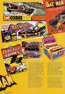
The above does not adhere to a grid with the photos but the text seems to adhere to a grid format.
All the diffrent items are spread across multiple positions which does not adhere to a grid.
Find 2 examples from anywhere that adhere to a grid. Car signage, clothing, architecture.
The above two pictures adhere to a grid system.


No comments:
Post a Comment